
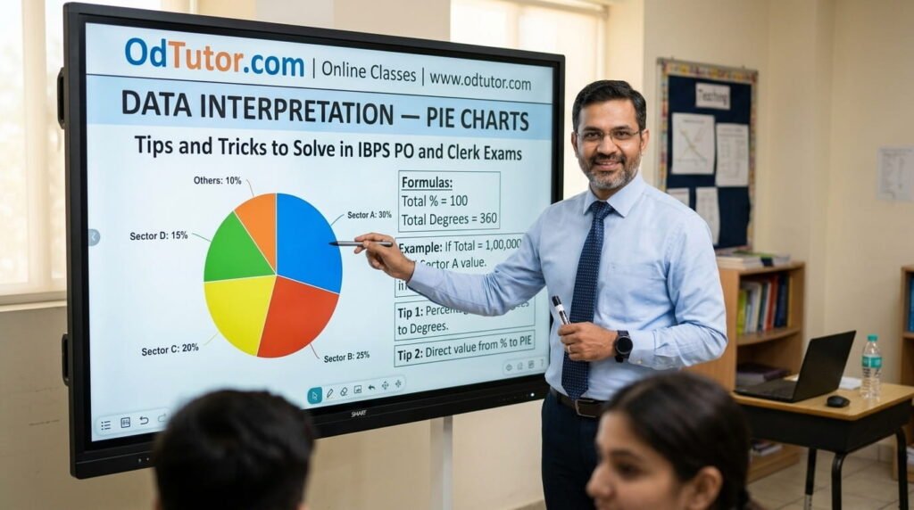
Hello students, “Ap Log kaise hain?” I am Rahul Sir from OdTutor, and today we are going to completely master the third and arguably the most visually distinctive format of Data Interpretation that competitive banking exams test — Pie Charts. If you have been following my articles on Table Charts and Bar Charts, you already understand the core philosophy of Data Interpretation: the mathematical concepts being tested are not new, the calculation formulas are familiar, and the real skill being developed is the ability to read data accurately and calculate efficiently under time pressure. Today, that same philosophy applies to a format that presents data in a fundamentally different visual form — the circular chart — and introduces some unique reading challenges and calculation techniques that you must be specifically prepared for.
Let me tell you what I see every year among students preparing for IBPS and SBI exams at OdTutor: Pie Charts provoke one of two extreme reactions. Some students love them — the format looks simple, the segments are visually clear, and the questions seem straightforward. Other students are deeply uncomfortable with them — they find the angular or percentage-based readings confusing, they struggle with the conversion between degrees and percentages, and they lose time trying to compare sectors that appear visually similar in size. Both reactions — overconfidence and excessive caution — lead to preventable errors. What I want to build in you today is something more valuable than either reaction: a calm, systematic, accurate approach that works reliably for every Pie Chart question regardless of how the data is presented.
Here is the fundamental truth about Pie Charts that I establish in every DI class at OdTutor: a Pie Chart is simply a circle representing a total of 100% or 360 degrees, divided into sectors where each sector’s size is proportional to its percentage share of the whole. Every single Pie Chart question reduces to one core operation — finding the actual value of a sector using the given total and the sector’s percentage or degree value. Every other question type — ratio, comparison, percentage change, profit calculation — is simply a variation of this core operation. Master that one operation, build familiarity with the degree-percentage conversion, and every Pie Chart DI set becomes a fast, manageable, high-scoring opportunity.
At OdTutor, I teach Pie Charts with a specific focus on the degree-percentage-value triangle of conversions, the particular question types that IBPS examiners favor in pie-format DI sets, and the visual shortcuts that allow fast comparison without full calculation. In this article, I am going to walk you through everything — the types of Pie Charts, the correct reading protocol, every major question type with fully solved examples, the shortcuts that save time, the mistakes that cost marks, and the structured practice strategy that builds genuine exam-ready performance. Read every section carefully, practice every example actively, and by the end of this article you will approach every Pie Chart DI set with the precision, speed, and quiet confidence of a thoroughly prepared student.
Let’s begin.
1. Understanding Pie Charts — Structure, Types, and What They Represent
Before any calculation technique or solving strategy, you must understand exactly what a Pie Chart is, how it encodes information, and what the different types look like in actual IBPS exam papers. This foundational understanding shapes every reading and solving habit you will build throughout this format.
A Pie Chart is a circular graph divided into sectors, where each sector represents a category’s share of the total. The size of each sector — measured either as an angle at the center in degrees, or as a percentage of the total circle — is directly proportional to the category’s contribution to the whole.
The total circle always represents either 100% or 360 degrees. These two representations are mathematically equivalent and interchangeable:
Percentage to Degrees: Degrees = (Percentage / 100) × 360
Degrees to Percentage: Percentage = (Degrees / 360) × 100
The Three Main Types of Pie Charts in IBPS Exams:
Type 1 — Percentage Pie Chart: Each sector is labeled with its percentage value (e.g., 25%, 18%, 32%). This is the most common type in IBPS exams. The total value of whatever is being measured is given separately, either in the chart title or in the question stem.
Type 2 — Degree Pie Chart: Each sector is labeled with its central angle in degrees (e.g., 90°, 72°, 54°). This type requires you to convert degrees to percentages before finding actual values. The conversion formula: Percentage = (Degree / 360) × 100.
Type 3 — Double Pie Chart: Two pie charts are presented side by side, representing the same categories for two different time periods, two different groups, or two different variables. Questions typically ask for comparison between the two charts — which category increased its share, what was the actual value in each chart, and what was the percentage change. This is the most complex Pie Chart type and appears predominantly in IBPS PO exams.
Key Structural Elements You Must Identify Before Solving:
The title of the chart (what total value is being distributed), the total value (explicitly stated or derivable), the label of each sector (category name and its percentage or degree value), and in double pie charts, the legend distinguishing which chart represents which group or period. Every single one of these elements must be consciously read before you attempt a single question.
2. The Core Operation of Pie Charts — The Percentage-Value Conversion
Every Pie Chart question, regardless of how it is worded or how complex it appears, is built on one fundamental operation: converting a sector’s percentage (or degree) into its actual value using the given total. Master this one operation and you have the engine that drives every Pie Chart calculation.
The Master Formula:
Actual Value of a Sector = (Sector Percentage / 100) × Total Value
Or equivalently for degree-labeled charts:
Actual Value of a Sector = (Sector Degrees / 360) × Total Value
Let me illustrate with a simple example before moving to full question sets:
Example: A Pie Chart shows the distribution of ₹12,000 among five expense categories. If the sector for “Food” represents 25%, what is the actual amount spent on Food?
Solution:
Actual value = (25/100) × 12000 = ₹3,000
That is the entire operation. Every Pie Chart question either asks this directly or asks you to apply this operation as a step within a larger calculation (such as finding the ratio of two sectors’ actual values, or finding the percentage change from one pie chart to another).
The Degree Conversion:
Example: A sector in a degree-labeled Pie Chart has a central angle of 72°. The total value represented by the chart is 5,000 units. What is the actual value of this sector?
Solution:
Method 1: Convert degrees to percentage first: (72/360) × 100 = 20%
Actual value = (20/100) × 5000 = 1,000 units
Method 2: Apply degree formula directly: (72/360) × 5000 = (1/5) × 5000 = 1,000 units
I always advise students to use Method 2 — applying the degree formula directly — rather than first converting to percentage and then finding the value. It eliminates one intermediate step and reduces the chance of rounding errors in questions where the percentage is a non-round number.
3. Sample Percentage Pie Chart and Complete Question Set — Full Walkthrough
Let me now present a complete sample Pie Chart scenario with five questions, exactly as IBPS formats them, and walk through each with full step-by-step solutions. I want you to practice extracting values from the described chart as carefully as you would from an actual printed chart.
Pie Chart: Distribution of monthly expenses of a family with total monthly income of ₹50,000
Rent — 30%, Food — 25%, Education — 15%, Clothing — 10%, Entertainment — 8%, Savings — 12%
Question 1: What is the amount spent on Rent per month?
Solution:
Actual value = (30/100) × 50000 = ₹15,000
Question 2: What is the ratio of amount spent on Food to amount spent on Education?
Solution:
Food = (25/100) × 50000 = ₹12,500
Education = (15/100) × 50000 = ₹7,500
Ratio = 12500:7500 = 5:3
Ratio = 5:3
Shortcut: When both sectors belong to the same pie chart, their actual values are proportional to their percentages. So the ratio of Food to Education = ratio of their percentages = 25:15 = 5:3. You don’t need to calculate actual values at all. This shortcut works for ANY ratio question within a single Pie Chart — compare percentages directly rather than converting to actual values first.
Question 3: By how much does the amount spent on Rent exceed the amount saved?
Solution:
Rent = (30/100) × 50000 = ₹15,000
Savings = (12/100) × 50000 = ₹6,000
Difference = 15000 − 6000 = ₹9,000
Question 4: What percentage of the non-savings expenditure does Entertainment constitute?
Solution:
Non-savings expenditure percentage = 100 − 12 = 88%
Non-savings amount = (88/100) × 50000 = ₹44,000
Entertainment = (8/100) × 50000 = ₹4,000
Entertainment as % of non-savings = (4000/44000) × 100 = (8/88) × 100 = 9.09%
Question 5: If the family’s income increases by 20% next month while all percentage allocations remain the same, what will be the new amount spent on Education?
Solution:
New income = 50000 × 1.20 = ₹60,000
New Education amount = (15/100) × 60000 = ₹9,000
4. Degree-Based Pie Chart Questions — Conversion and Calculation
Degree-based Pie Charts are tested in IBPS PO exams more often than in Clerk exams, and they introduce an additional conversion step that slower students handle inefficiently. Let me show you the fastest approach to these questions with a complete example set.
Pie Chart: Distribution of 7,200 employees across six departments of a company (in degrees)
HR — 60°, Finance — 90°, Operations — 72°, IT — 54°, Marketing — 48°, Administration — 36°
Total degrees = 60+90+72+54+48+36 = 360° ✓
Question 1: How many employees work in the Finance department?
Solution:
Employees in Finance = (90/360) × 7200 = (1/4) × 7200 = 1,800 employees
Question 2: What percentage of total employees work in IT?
Solution:
IT percentage = (54/360) × 100 = 15%
15% of employees work in IT.
Question 3: What is the ratio of employees in HR to employees in Marketing?
Solution:
Shortcut: Ratio of sectors = ratio of their degrees (since both are from same total)
HR:Marketing = 60°:48° = 5:4
Ratio = 5:4
Question 4: How many more employees work in Operations than in Administration?
Solution:
Operations = (72/360) × 7200 = (1/5) × 7200 = 1,440
Administration = (36/360) × 7200 = (1/10) × 7200 = 720
Difference = 1440 − 720 = 720 employees
Shortcut: Difference in degrees = 72° − 36° = 36°. Extra employees = (36/360) × 7200 = 720. Apply the master formula directly to the difference in degrees rather than calculating each sector separately and subtracting. This saves one intermediate calculation.
Question 5: If the company plans to increase the IT department by 50%, what will be the new degree of the IT sector if the chart is redrawn with the updated total?
Solution:
Current IT employees = (54/360) × 7200 = 1,080
New IT employees = 1080 × 1.5 = 1,620
New total employees = 7200 − 1080 + 1620 = 7,740
New IT degree = (1620/7740) × 360 = 583200/7740 ≈ 75.35°
This type of question — asking you to recalculate a degree after a change in one sector’s value — is a classic IBPS PO level question that requires careful sequential calculation. Note that the total changes when one sector changes, so you must recalculate the new total before finding the new degree.
5. Double Pie Chart Questions — Comparison Across Two Charts
Double Pie Charts are the most information-rich and most analytically demanding pie chart format in IBPS exams. They present two pie charts side by side — typically for two different years, two different regions, or two different companies — and ask you to compare values, calculate growth, and analyze changes in distribution between the two charts.
Double Pie Chart Scenario:
Chart 1 (2021): Distribution of 40,000 total sales units across five products
Product A — 20%, Product B — 25%, Product C — 15%, Product D — 30%, Product E — 10%
Chart 2 (2022): Distribution of 60,000 total sales units across the same five products
Product A — 25%, Product B — 20%, Product C — 20%, Product D — 25%, Product E — 10%
Question 1: What is the percentage increase in sales of Product A from 2021 to 2022?
Solution:
2021 sales of A = (20/100) × 40000 = 8,000
2022 sales of A = (25/100) × 60000 = 15,000
Increase = 15000 − 8000 = 7,000
Percentage increase = (7000/8000) × 100 = 87.5%
Question 2: Which product showed the highest absolute increase in sales from 2021 to 2022?
Solution:
Calculate actual sales for each product in both years:
Product A: 2021 = 8,000 → 2022 = 15,000 → Increase = 7,000
Product B: 2021 = 10,000 → 2022 = 12,000 → Increase = 2,000
Product C: 2021 = 6,000 → 2022 = 12,000 → Increase = 6,000
Product D: 2021 = 12,000 → 2022 = 15,000 → Increase = 3,000
Product E: 2021 = 4,000 → 2022 = 6,000 → Increase = 2,000
Highest absolute increase: Product A with 7,000 units
Question 3: The percentage share of which product decreased from 2021 to 2022?
Solution:
Compare percentage shares directly between the two charts (no actual value calculation needed):
A: 20% → 25% (increased)
B: 25% → 20% (decreased) ✓
C: 15% → 20% (increased)
D: 30% → 25% (decreased) ✓
E: 10% → 10% (unchanged)
Products B and D showed decreased percentage shares.
Question 4: What is the ratio of total sales of Product C in 2021 to total sales of Product C in 2022?
Solution:
2021 Product C = 6,000
2022 Product C = 12,000
Ratio = 6000:12000 = 1:2
Question 5: What is the combined sales of Products A and B in 2022 as a percentage of the 2022 total?
Solution:
A + B percentage in 2022 = 25 + 20 = 45%
This directly answers the question — no actual value calculation needed.
Combined share = 45%
I always stress this to my students: in double pie chart comparison questions, always start by identifying whether the question is asking about actual values (requiring full conversion) or percentage shares (which can be compared directly from the chart without conversion). Mixing these two up wastes enormous time and produces wrong answers.
6. Ratio Questions in Pie Charts — The Most Important Shortcut
Ratio questions are extremely common in Pie Chart DI sets and offer the most powerful shortcut opportunity of any question type in this format. Understanding when to use the shortcut and when full calculation is needed is a critical exam skill that can save you 30 to 40 seconds across a five-question DI set.
The Ratio Shortcut Rule:
When both sectors being compared belong to the SAME Pie Chart (same total), their actual value ratio equals their percentage ratio or their degree ratio directly. No conversion to actual values is needed.
Why this works: If both sectors share the same total T, then:
Sector A actual value = (% A / 100) × T
Sector B actual value = (% B / 100) × T
Ratio A:B = (% A × T) : (% B × T) = % A : % B
The total T cancels out completely.
When the shortcut DOES NOT apply:
When sectors are from DIFFERENT Pie Charts (different totals), you must calculate actual values for both before comparing, because the totals are different and do not cancel.
Question 1 (Shortcut applies): Using the Section 3 chart, find the ratio of amount spent on Clothing to amount spent on Entertainment.
Solution:
Both sectors from the same chart. Ratio = percentage ratio = 10:8 = 5:4
Ratio = 5:4 (no calculation needed)
Question 2 (Shortcut does NOT apply): Using the double pie chart from Section 5, find the ratio of Product B sales in 2021 to Product B sales in 2022.
Solution:
2021 total = 40,000, 2022 total = 60,000 (different totals — must calculate)
2021 Product B = (25/100) × 40000 = 10,000
2022 Product B = (20/100) × 60000 = 12,000
Ratio = 10000:12000 = 5:6
Ratio = 5:6
Question 3: In a Pie Chart showing production distribution with total production of 90,000 units, sector P = 40° and sector Q = 60°. Find the ratio of P to Q.
Solution:
Both from the same chart. Ratio = degree ratio = 40:60 = 2:3
Ratio = 2:3 (no calculation needed)
I cannot overemphasize how much time this shortcut saves in exam conditions. Every ratio question within a single pie chart that you solve using percentages or degrees directly — rather than converting to actual values — saves approximately 20 to 25 seconds. Across two or three such questions in a five-question set, this adds up to over a minute of saved time that can be applied to more complex questions elsewhere in the paper.
7. Percentage Change Questions — Connecting Two Pie Charts
Percentage change questions in Pie Chart DI are most commonly encountered in double pie chart sets, where you are asked how much a particular sector’s actual value changed between two time periods. These questions require full calculation — the ratio shortcut does not apply — and they test your ability to correctly use two different totals for the two different charts.
The Standard Approach:
Step 1: Calculate the actual value of the sector in Chart 1 using Total 1.
Step 2: Calculate the actual value of the sector in Chart 2 using Total 2.
Step 3: Apply the percentage change formula: [(New − Old) / Old] × 100
Using the double pie chart from Section 5:
Question 1: What is the percentage increase in sales of Product C from 2021 to 2022?
Solution:
2021 Product C = (15/100) × 40000 = 6,000
2022 Product C = (20/100) × 60000 = 12,000
Increase = 12000 − 6000 = 6,000
Percentage increase = (6000/6000) × 100 = 100%
Question 2: What is the percentage decrease in sales of Product B from 2021 to 2022?
Solution:
2021 Product B = 10,000, 2022 Product B = 12,000
Product B actually increased from 10,000 to 12,000 — so there is no decrease.
Percentage increase = (2000/10000) × 100 = 20% increase
This is a deliberate trap that IBPS examiners use frequently: a product’s percentage SHARE in the pie chart decreases (Product B went from 25% to 20%) while its ACTUAL VALUE increases (from 10,000 to 12,000) because the total grew significantly. Students who confuse the decrease in percentage share with a decrease in actual value fall into this trap every time. Always calculate actual values for percentage change questions — never rely on percentage share comparisons from the chart alone.
Question 3: By what percentage did total sales grow from 2021 to 2022?
Solution:
2021 total = 40,000, 2022 total = 60,000
Growth = 20,000
Percentage growth = (20000/40000) × 100 = 50%
The Total Growth Shortcut: When the question asks about total growth between two charts, simply apply the percentage change formula to the two given totals directly — you don’t need to look at individual sector percentages at all. This is a fast, single-step calculation that many students complicate unnecessarily.
8. Central Angle and Sector Value Interconversion — Advanced Question Types
Some IBPS PO level Pie Chart questions work in the reverse direction from what we have covered so far — instead of giving you the percentage or degree and asking for the actual value, they give you the actual value and ask you to find the percentage or degree. Others give you the value of one sector and ask you to find the value of another sector using their relationship. Let me walk through these reverse and relational question types.
Type 1 — Find the Degree Given the Actual Value:
Question: In a pie chart representing total expenditure of ₹1,80,000, the amount spent on transport is ₹27,000. What is the central angle of the transport sector?
Solution:
Percentage of transport = (27000/180000) × 100 = 15%
Central angle = (15/100) × 360 = 54°
Direct method: Central angle = (Actual Value / Total Value) × 360 = (27000/180000) × 360 = 54°
Type 2 — Find One Sector’s Value Using Another’s Value:
Question: In a pie chart, Sector A represents 30° and Sector B represents 45°. If Sector A has an actual value of 1,500 units, what is the actual value of Sector B?
Solution:
Since both sectors belong to the same chart:
Sector A / Sector B = 30/45 = 2/3
If Sector A = 1500, then Sector B = 1500 × (3/2) = 2,250 units
This eliminates the need to find the total first — a useful shortcut when the total is not directly given.
Type 3 — Finding the Total From a Sector’s Value:
Question: In a pie chart, a sector representing 18% has an actual value of 9,000. What is the total value represented by the chart?
Solution:
(18/100) × Total = 9000
Total = (9000 × 100) / 18 = 50,000
Type 4 — Missing Sector Percentage:
Question: A pie chart has five sectors with percentages: 25%, 20%, 18%, 15%, and an unknown sector. What is the percentage and actual value of the unknown sector if the total is ₹2,40,000?
Solution:
Known percentages sum = 25+20+18+15 = 78%
Unknown sector percentage = 100 − 78 = 22%
Actual value = (22/100) × 240000 = ₹52,800
These reverse and relational question types test a deeper understanding of the pie chart structure and appear more frequently in IBPS PO Mains than in Clerk or Prelims papers. Practicing all four types systematically is what separates thorough PO preparation from Clerk-level preparation in this chapter.
9. Common Mistakes Students Make in Pie Chart DI
After years of teaching DI at OdTutor, I have identified the specific mistakes that students make in Pie Chart questions far more frequently than in other DI formats. Every mistake listed here is entirely avoidable with the right habits and awareness.
Mistake 1 — Not reading the total value carefully. The most fundamental error in Pie Chart DI. The total value is sometimes given in the chart title, sometimes in a note below the chart, and sometimes within the question stem itself. Students who miss it or misread it produce answers that are systematically wrong by the same factor. Always locate and note the total value before attempting any question.
Mistake 2 — Applying the ratio shortcut across two different pie charts. The ratio shortcut (comparing percentages directly) only works within a single chart where the total is the same. When comparing sectors from two different charts with different totals, this shortcut gives wrong answers. Always check whether the sectors being compared are from the same or different charts before deciding to shortcut.
Mistake 3 — Confusing percentage share change with actual value change. A sector’s percentage share in a pie chart can decrease even when its actual value increases, if the total grows faster than the sector. This is the most conceptually tricky distinction in double pie chart questions, and IBPS exploits it deliberately in question design. Always calculate actual values for percentage change questions — never compare percentage shares alone.
Mistake 4 — Rounding percentages or degrees before calculating. Some pie charts show sectors labeled as 33.33% or 22.5° — values that don’t simplify neatly. Students who round these to 33% or 22° before calculating introduce errors that accumulate and produce answers that don’t match any option. Keep all decimal values intact until the final step.
Mistake 5 — Not verifying that all sector percentages sum to 100 (or degrees sum to 360). Before solving any question, quickly sum all given sector values. If they don’t sum to 100% or 360°, either the chart has a missing sector or you are misreading a value. Catching this discrepancy before calculating saves enormous time compared to discovering it after getting an answer that matches no option.
Mistake 6 — Calculating actual values when percentages comparison is sufficient. For questions asking which sector is largest, or what the ratio of two sectors in the same chart is, students who calculate actual values are doing three to four times more work than necessary. Train yourself to identify when percentage or degree comparison alone answers the question completely.
Mistake 7 — Getting confused between “percentage of the total” and “percentage more or less than.” “What percentage of total spending is rent?” uses the total as the base. “By what percentage does rent exceed savings?” uses savings as the base. These are different calculations with different bases, and confusing them produces answers that are both wrong and plausible-looking.
Mistake 8 — Not drawing a quick data table before solving double pie chart sets. Double pie charts pack a lot of information — two sets of percentages, two different totals, and five or more categories across both. Students who try to hold all of this in memory while solving questions make extraction errors. Always take 30 seconds to write a small two-column table of actual values for each sector in both charts before beginning to solve questions.
10. Practice Strategy for Mastering Pie Chart DI Before the Exam
Let me close this article with the comprehensive, structured preparation roadmap I give every OdTutor student for achieving complete exam-level mastery of Pie Chart Data Interpretation. As with all DI formats, the strategy here is as important as content understanding — because Pie Chart DI is a performance skill that must be built through structured, high-volume, feedback-driven practice with continuous error analysis.
Days 1–2 — Core Conversion Mastery: Before attempting any full Pie Chart question set, spend the first two days building absolute fluency in the three conversions that underpin every Pie Chart calculation. Conversion 1: Percentage to actual value — (Percentage/100) × Total. Conversion 2: Degree to actual value — (Degree/360) × Total. Conversion 3: Actual value to percentage or degree — (Value/Total) × 100 or × 360. Practice each conversion in both directions with self-imposed time limits — each conversion should take under 10 seconds for clean numbers and under 20 seconds for decimal values. This speed is what makes Pie Chart questions fast rather than slow.
Day 3 — Ratio Shortcut Drills: Spend this day exclusively practicing the ratio shortcut — finding ratios of sectors within the same pie chart using percentage or degree comparisons directly, without converting to actual values. Verify every shortcut answer by also calculating the full actual values and confirming the ratio matches. This verification step builds your confidence in the shortcut so you apply it without hesitation in exam conditions. Practice at least 20 ratio questions using this shortcut before moving on.
Days 4–5 — Single Pie Chart Full Set Practice: Begin solving complete five-question single pie chart sets — both percentage-labeled and degree-labeled variants. On Day 4, focus entirely on accuracy without time pressure. Verify every answer using the total-check method: confirm that your extracted values, when summed, equal the given total. On Day 5, introduce a time limit of four to five minutes per set and work toward completing each set accurately within that window.
Days 6–7 — Double Pie Chart Practice: Move to double pie chart sets. These are more complex and require careful management of two different totals. Begin every double pie chart set by immediately writing a quick data table — actual values for all sectors in both charts — before reading any question. This upfront investment of 45 to 60 seconds eliminates the most common double pie chart errors and makes each individual question faster to solve. Solve at least eight to ten full double pie chart sets over these two days.
Days 8–9 — Reverse and Relational Question Types: Work through the four advanced question types from Section 8 — finding degree from actual value, finding one sector from another, finding total from a sector, and identifying missing percentages. These types appear in IBPS PO Mains and require recognizing that the master formula can be applied in reverse. Solve at least 25 questions of these advanced types across these two days, building the formula-reversal fluency that separates PO-level performance from Clerk-level performance.
Days 10–11 — Mixed Format Practice: Solve mixed DI practice sessions where percentage-labeled, degree-labeled, and double pie chart sets appear in random order. This forces you to identify the chart type, choose the correct reading approach, and apply the right shortcuts for each type — exactly as you will encounter them in the actual exam. Maintain a strict time limit of five minutes per set throughout.
Days 12 onwards — Full Mock Test Integration and Error Analysis: Include two to three Pie Chart DI sets in every daily mock test from this point forward. After each mock test, review every DI error with one specific question: “Was this a reading error, a conversion error, a formula error, or a shortcut misapplication?” Create a personal error frequency table showing how often each error type occurs. Direct your next focused practice session at your highest-frequency error type. This targeted error elimination is what produces the steady, measurable improvement that shows up in mock test scores over time.
Ongoing — Previous Year Paper Analysis: Dedicate time each week to solving Pie Chart DI sets from previous year IBPS PO, IBPS Clerk, SBI PO, and SBI Clerk papers. These papers reveal whether IBPS favors percentage or degree charts for specific exams, how complex the double pie charts tend to be, which calculation types appear most frequently, and what level of precision the answer choices demand. Understanding these patterns is what allows you to calibrate your preparation effort precisely and focus your energy on the question types that will actually appear in your target exam.
The Single Most Important Habit — Always Note the Total First: Throughout your entire Pie Chart DI preparation, maintain one absolute discipline: before reading a single question, locate the total value, note it clearly at the top of your rough work, and circle it. This five-second habit prevents the single most common and most costly Pie Chart mistake — using the wrong total or forgetting the total midway through a multi-step calculation. Students who make this habit automatic report a dramatic reduction in careless errors across all Pie Chart question types.
Pie Chart DI ultimately rewards a combination of conversion fluency, shortcut awareness, and disciplined data management. Unlike Table Charts where all values are explicitly stated, Pie Charts require you to convert visual proportions into numerical values before any calculation can begin — and that additional step is where unprepared students lose both time and accuracy. The goal of your preparation is to make every conversion so fast and automatic that it feels effortless, leaving your full cognitive capacity free for the analytical thinking that the questions actually demand. At OdTutor, that automation is exactly what we build through our structured, high-volume, shortcut-focused teaching approach — taking every student from the initial unfamiliarity of circular chart reading to the smooth, confident, efficient performance that top scorers demonstrate on exam day.
How Teachers from OdTutor Can Help
At OdTutor, our trainers understand that Pie Chart DI demands a specific combination of conversion fluency, shortcut mastery, and careful data management that must be developed through structured, deliberate practice — and every element of how Rahul Sir and the OdTutor team teach this format reflects that understanding precisely. Through live sessions covering the degree-percentage-value conversion triangle, the ratio shortcut and exactly when it applies, dedicated workshops on double pie chart analysis and reverse calculation question types, and timed full-set practice mapped precisely to IBPS PO, IBPS Clerk, SBI PO, and SBI Clerk exam standards, OdTutor gives every student the technical skills, shortcut vocabulary, and exam temperament needed to perform at their best under real exam conditions. With personalized performance tracking, detailed mock test analysis pinpointing each student’s specific error patterns, and access to a curated question bank built from previous year papers and current exam patterns, OdTutor transforms Pie Chart DI from a format that students approach with visual confusion and calculation uncertainty into one of the fastest, most accurate, and most confidently attempted sections in every competitive exam you sit.