
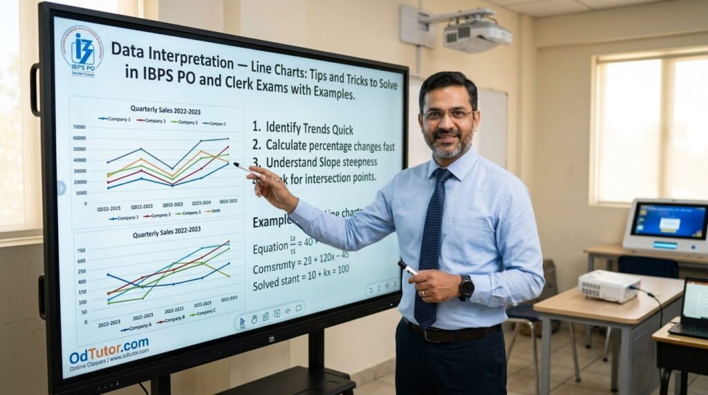
Hello students, I am Rahul Sir from OdTutor, and today we are going to thoroughly master the fourth major format of Data Interpretation tested in competitive banking examinations — Line Charts. If you have been following my DI series covering Table Charts, Bar Charts, and Pie Charts, you already possess a strong foundation in how Data Interpretation works as a discipline — how to read data formats accurately, how to extract values efficiently, and how to apply percentage, ratio, average, and growth rate calculations under time pressure. Today, we bring that same structured approach to a format that is uniquely designed to show trends over time, and that unique purpose introduces both distinctive strengths and very specific challenges that you must understand and prepare for deliberately.
Let me share an observation I make every year at OdTutor: among all the DI formats tested in IBPS and SBI exams, Line Charts are the ones where students most frequently make the transition from slow and uncertain to fast and confident in the shortest amount of preparation time. And the reason is straightforward — Line Charts are visually intuitive. A rising line means values are increasing. A falling line means values are decreasing. A flat line means values are stable. This visual storytelling quality makes Line Charts the most naturally readable DI format, and students who learn to trust and leverage that visual narrative alongside precise point reading can solve Line Chart question sets faster than almost any other format in the exam.
However, that same visual intuitiveness is also the source of Line Charts’ most dangerous trap — the temptation to estimate. When you can see that one line is clearly above another, or that a line is rising steeply between two years, the instinct is to estimate the magnitude of that difference or that rise rather than reading the precise values from the graph. In IBPS exams, where answer choices are often close and where a misread of even one data point can cascade into a wrong answer across multiple questions, estimation without verification is a genuinely costly habit. The students who consistently score full marks on Line Chart DI sets are those who have learned to combine visual trend reading — for direction and relative magnitude — with precise point reading from the scale — for actual values used in calculations.
At OdTutor, I teach Line Charts with a specific focus on accurate point reading from both single and multiple line charts, the trend analysis techniques that answer comparison and ranking questions instantly, and the calculation shortcuts that work particularly well for the growth-rate and difference-based questions that IBPS examiners favor in line-format DI sets. In this article, I am going to walk you through everything — the types of Line Charts, the correct reading protocol, every major question type with fully solved examples, the visual shortcuts that save time, the mistakes that cost marks, and the complete practice strategy that builds genuine exam-ready performance. Read every section carefully, practice every example actively, and by the end of this article you will approach every Line Chart DI set with the analytical confidence and calculation efficiency that top scorers bring to every exam they sit.
1. Understanding Line Charts — Structure, Types, and What They Represent
Before any calculation technique or solving strategy, you must understand what a Line Chart is, how it encodes information, and what the different types look like in actual IBPS exam papers. This foundational clarity shapes every reading and solving habit you will build throughout your Line Chart preparation.
A Line Chart is a graphical representation of data in which individual data points are plotted on a coordinate grid and then connected by straight line segments. The horizontal axis (X-axis) typically represents a sequence of time periods — years, months, quarters, or other intervals — while the vertical axis (Y-axis) represents the variable being measured, such as sales figures, production quantities, population, or profit percentages. The resulting connected line visually shows how the measured variable changes across the time sequence, making trends — increases, decreases, fluctuations, and stability — immediately visible.
The Four Main Types of Line Charts in IBPS Exams:
Type 1 — Single Line Chart: One line represents one variable across multiple time periods. This is the simplest type and most common in IBPS Clerk exams. It directly shows the trend of a single variable over time. For example, annual profit of a company from 2017 to 2022 shown as a single connected line. Reading is straightforward: identify each point’s coordinates by reading its position against the Y-axis scale.
Type 2 — Double Line Chart: Two lines on the same graph represent two different variables across the same time periods. For example, income and expenditure of a company over five years shown as two separate lines, typically distinguished by different colors, line styles (solid vs. dashed), or symbols at data points. This type is extremely common in IBPS PO exams because it enables comparison questions between two variables. Reading requires carefully identifying which line corresponds to which variable using the provided legend before reading any point.
Type 3 — Multiple Line Chart: Three or more lines on the same graph, each representing a different variable, category, or entity. For example, sales of five different products over four years, shown as five separate lines. This type is the most information-rich and appears in IBPS PO Mains. It tests your ability to isolate and read individual lines without confusing them — a critical skill in visually complex charts.
Type 4 — Line Chart with Two Y-Axes: An advanced variant where two different scales are used on the left and right Y-axes to represent two variables with very different magnitudes on the same graph. For example, absolute sales figures (in crores, on the left Y-axis) and sales growth percentage (on the right Y-axis) plotted together. Reading this type correctly requires always checking which Y-axis applies to which line before reading any point.
Key Structural Elements You Must Identify Before Solving:
The title of the chart (what is being measured and over what time period), the X-axis label and intervals (what time periods are shown), the Y-axis label and scale (what is being measured and in what units), the legend (which line represents which variable in multi-line charts), and whether any secondary Y-axis exists and which line uses it. Every single one of these elements must be consciously identified before you read a single data point or attempt a single question.
2. How to Read a Line Chart Accurately — The Point-Reading Protocol
Accurate point reading is the foundational skill of Line Chart DI, and it is the skill that students most frequently underestimate or skip. I emphasize this repeatedly in my OdTutor DI classes because the entire calculation structure of every question depends on the accuracy of the values you read from the chart — and a misread point produces a wrong answer regardless of how correctly you apply the formula afterward.
Here is the exact point-reading protocol I teach every student:
Step 1 — Identify and note the Y-axis scale. Before reading any point, determine the interval between consecutive gridlines on the Y-axis. It might be 10, 20, 25, 50, 100, or any other value. Never assume — always verify by reading at least two consecutive gridline values and computing their difference. Also note whether the Y-axis starts at zero or at some other value.
Step 2 — For each data point on the line, read directly. For points that fall exactly on a gridline, read the gridline value directly. For points between gridlines, estimate their position proportionally. In well-designed IBPS charts, points almost always fall exactly on gridlines or at clearly identifiable fractional positions — pure guesswork is rarely required.
Step 3 — For multi-line charts, identify the correct line before reading each point. Check the legend carefully and confirm which line you are reading before noting any value. In charts where lines cross each other or run closely together, this step requires extra deliberateness.
Step 4 — After reading all required points, record them clearly on your rough sheet. Never rely on memory for values in a five-question DI set. Write each extracted value next to its label (year, category, or line name) before beginning any calculation.
Step 5 — Perform a quick visual sanity check. After reading a set of values, glance at the line’s overall shape. If the line is clearly rising from left to right but one of your extracted values shows a decrease, you’ve made a reading error — re-read that point before proceeding.
Step 6 — For two-Y-axis charts, always confirm which axis applies to which line before reading any point. This confirmation takes three seconds and prevents the systematic errors that arise from applying the wrong scale to a line throughout an entire question set.
This protocol adds 30 to 40 seconds to your initial chart engagement but eliminates the point-reading errors that are the primary source of wrong answers in Line Chart DI.
3. Sample Single Line Chart and Complete Question Set — Full Walkthrough
Let me now present a complete single line chart scenario with five questions and walk through each with full step-by-step solutions, exactly as IBPS formats these question sets.
Line Chart: Annual Profit (in ₹ lakhs) of a company from 2017 to 2022
Year — Profit (₹ lakhs): 2017 — 120, 2018 — 150, 2019 — 180, 2020 — 140, 2021 — 200, 2022 — 240
Y-axis: 0 to 280 in intervals of 40
Question 1: What is the total profit earned by the company over all six years?
Solution:
Extract all values: 120, 150, 180, 140, 200, 240
Running sum: 120 → 270 → 450 → 590 → 790 → 1030
Total profit = ₹1,030 lakhs
Question 2: In which year did the company record the highest percentage increase in profit compared to the previous year?
Solution:
2018: [(150−120)/120] × 100 = 25%
2019: [(180−150)/150] × 100 = 20%
2020: [(140−180)/180] × 100 = −22.22% (decline)
2021: [(200−140)/140] × 100 = 42.86%
2022: [(240−200)/200] × 100 = 20%
Highest percentage increase: 2021 at 42.86%
Question 3: What is the average annual profit over the six-year period?
Solution:
Total = ₹1,030 lakhs, Count = 6
Average = 1030/6 = ₹171.67 lakhs approximately
Question 4: The profit in 2020 was what percentage less than the profit in 2019?
Solution:
2019 = 180, 2020 = 140
Decrease = 40
Percentage decrease = (40/180) × 100 = 22.22%
Profit in 2020 was approximately 22.22% less than in 2019.
Question 5: If the profit in 2023 is projected to be 25% more than in 2022, what will the projected profit be?
Solution:
2022 profit = 240
25% of 240 = 60
Projected 2023 profit = 240 + 60 = ₹300 lakhs
4. Double Line Chart Questions — Comparing Two Variables Across Time
Double Line Charts are the most frequently tested Line Chart format in IBPS PO exams, and they deserve dedicated preparation because the comparison questions they enable — between income and expenditure, production and sales, target and achievement — are exactly the type of multi-variable analysis that banking job roles demand in real life. Let me walk you through a complete double line chart set with the specific techniques that make these questions fast and accurate.
Line Chart: Income and Expenditure (in ₹ crores) of a company from 2018 to 2022
| Year | Income | Expenditure |
|---|---|---|
| 2018 | 80 | 60 |
| 2019 | 100 | 75 |
| 2020 | 90 | 80 |
| 2021 | 120 | 90 |
| 2022 | 150 | 100 |
(Imagine: solid line = Income, dashed line = Expenditure)
Question 1: In which year was the profit (Income − Expenditure) the highest?
Solution:
2018: 80 − 60 = 20
2019: 100 − 75 = 25
2020: 90 − 80 = 10
2021: 120 − 90 = 30
2022: 150 − 100 = 50
Highest profit: 2022 with ₹50 crores
Visual Shortcut: On a double line chart, profit is represented by the vertical gap between the Income line and the Expenditure line at each point. The year where the two lines are farthest apart (with Income above Expenditure) is the year of highest profit. Visually identifying the widest gap is faster than calculating all five differences — and you only need to calculate to confirm when two years appear visually similar in gap width.
Question 2: What is the percentage profit in 2020?
Solution:
Profit = 90 − 80 = ₹10 crores
Percentage profit = (Profit/Expenditure) × 100 = (10/80) × 100 = 12.5%
Question 3: In which year was the ratio of income to expenditure the highest?
Solution:
2018: 80/60 = 1.333
2019: 100/75 = 1.333
2020: 90/80 = 1.125
2021: 120/90 = 1.333
2022: 150/100 = 1.500
Highest ratio: 2022 at 1.5
Visual Shortcut: The ratio of Income to Expenditure is highest when the Income line is proportionally farthest above the Expenditure line — not just absolutely farthest. In 2022, Income is 150% of Expenditure. This proportional relationship is greater than the other years. When three years show the same ratio (2018, 2019, 2021 all at 1.333), only calculating 2022 and 2020 is needed to confirm 2022 as the maximum.
Question 4: What is the percentage increase in expenditure from 2018 to 2022?
Solution:
2018 expenditure = 60, 2022 expenditure = 100
Increase = 40
Percentage increase = (40/60) × 100 = 66.67%
Expenditure increased by approximately 66.67% from 2018 to 2022.
Question 5: What fraction of total income over all five years was the total expenditure?
Solution:
Total Income = 80+100+90+120+150 = 540
Total Expenditure = 60+75+80+90+100 = 405
Fraction = 405/540 = 3/4
Total expenditure was 3/4 of total income.
5. Trend Analysis — Reading the Line’s Story Before Calculating
One of the unique advantages of Line Charts over other DI formats is that the line itself tells a visual story about the data — and a student who learns to read that story quickly can answer several question types without any calculation at all. This is what I call trend analysis, and it is the skill that makes Line Chart DI genuinely fast for well-prepared students.
The Five Trend Patterns You Must Recognize Instantly:
Consistent Upward Trend: The line rises steadily from left to right across all periods. This tells you every year showed growth — so questions asking “in which year did the value decrease” are immediately answerable: none.
Consistent Downward Trend: The line falls steadily from left to right. Every year showed a decline.
Fluctuating Trend: The line rises and falls alternately across periods. Questions about the year of highest or lowest value require identifying the peak or trough visually before verifying with point reading.
Steep vs. Gradual Change: A steep line segment between two consecutive points indicates a large absolute change. A gradual segment indicates a small change. For percentage growth questions, steep segments with small base values (early in an upward trend) often correspond to the highest growth rate.
Convergence and Divergence (Double Line Charts): When two lines move toward each other, the gap between the two variables is shrinking. When they move away from each other, the gap is widening. For income-expenditure charts, convergence means profit is shrinking; divergence means profit is growing.
Applying Trend Analysis to Answer Questions Instantly:
Question: Using the double line chart from Section 4, in which year was the profit the lowest?
Answer by trend analysis: The lines are visually closest in 2020 (where Income = 90 and Expenditure = 80, gap = 10). No calculation needed beyond a quick visual check. Answer: 2020.
Question: Was there any year when expenditure exceeded income?
Answer by trend analysis: On the chart, the Expenditure line is always below the Income line — they never cross. Answer: No. No calculation needed.
Question: In which consecutive pair of years was the income growth the steepest?
Answer by trend analysis: The steepest segment on the Income line is between 2021 and 2022 (absolute increase of 30). Verify by checking: 2018−2019 = 20, 2019−2020 = −10, 2020−2021 = 30, 2021−2022 = 30. Answer: Both 2020−2021 and 2021−2022 are tied at 30.
Trend analysis does not replace calculation — it precedes it. Use it to narrow down candidates and eliminate wrong ones before committing to a specific calculation. This combined visual-then-numerical approach is what makes Line Chart DI both fast and accurate.
6. Growth Rate and Percentage Change — The Most Tested Line Chart Question Type
Growth rate questions dominate Line Chart DI sets in IBPS PO exams, and for good reason — Line Charts are specifically designed to show how values change over time, making them the natural format for testing growth rate analysis. Let me walk through every variant of this question type with the specific shortcuts that make them fast.
Bar Chart: Revenue (in ₹ lakhs) of a company from 2017 to 2022
Year — Revenue: 2017 — 200, 2018 — 240, 2019 — 300, 2020 — 270, 2021 — 360, 2022 — 450
Question 1: What is the year-on-year growth rate in revenue for each year from 2018 to 2022?
Solution:
2018: [(240−200)/200] × 100 = 20%
2019: [(300−240)/240] × 100 = 25%
2020: [(270−300)/300] × 100 = −10% (decline)
2021: [(360−270)/270] × 100 = 33.33%
2022: [(450−360)/360] × 100 = 25%
Highest growth year: 2021 at 33.33%
Question 2: In which year was the absolute increase in revenue the largest?
Solution:
2018: 240−200 = 40
2019: 300−240 = 60
2020: 270−300 = −30
2021: 360−270 = 90
2022: 450−360 = 90
Largest absolute increase: 2021 and 2022, both with ₹90 lakhs
The Steepest Segment Shortcut for Absolute Change:
On the Line Chart, the year with the largest absolute increase corresponds to the steepest rising segment. Simply identify the steepest upward segment visually, then verify by reading the two endpoint values. This visual identification narrows the calculation to one or two verification checks rather than all five year-on-year differences.
Question 3: What is the compound growth of revenue from 2017 to 2022?
Solution:
Simple overall growth = [(450−200)/200] × 100 = (250/200) × 100 = 125%
Note: IBPS exams at Clerk and Prelims level ask for overall percentage change, not compound annual growth rate (CAGR). The formula above gives the total percentage change over the entire period. Only IBPS PO Mains occasionally asks for CAGR, which involves the formula: CAGR = [(Final/Initial)^(1/n) − 1] × 100 where n is the number of years.
Question 4: If revenue declined at the same rate in 2023 as it did in 2020, what would the 2023 revenue be?
Solution:
Rate of decline in 2020 = 10%
2022 revenue = 450
2023 revenue = 450 × (1 − 10/100) = 450 × 0.9 = ₹405 lakhs
7. Multiple Line Chart Questions — Managing Three or More Lines
Multiple Line Charts — those with three or more lines on the same graph — are the most visually complex format in Line Chart DI and appear primarily in IBPS PO Mains. The mathematical concepts being tested remain identical to single and double line charts, but the additional challenge is accurately isolating and reading individual lines without confusing them in a visually dense graph. Let me show you the exact techniques for managing this complexity.
Multiple Line Chart Scenario: Sales (in thousand units) of three products P, Q, and R from 2018 to 2022
| Year | Product P | Product Q | Product R |
|---|---|---|---|
| 2018 | 40 | 50 | 30 |
| 2019 | 55 | 45 | 40 |
| 2020 | 50 | 60 | 55 |
| 2021 | 70 | 65 | 50 |
| 2022 | 80 | 70 | 65 |
Question 1: In which year were the combined sales of all three products the highest?
Solution:
Row totals:
2018: 40+50+30 = 120
2019: 55+45+40 = 140
2020: 50+60+55 = 165
2021: 70+65+50 = 185
2022: 80+70+65 = 215
Highest combined sales: 2022 with 215 thousand units
Visual Shortcut: On a multiple line chart, the year of highest combined sales is often visually identifiable as the rightmost point on an upward overall trend — check if all lines are at their highest rightward points simultaneously. When lines diverge significantly, calculation is necessary.
Question 2: Which product showed the most consistent growth across all years (i.e., increased every single year)?
Solution:
Product P: 40→55→50→70→80 (decreased in 2020 — not consistent)
Product Q: 50→45→60→65→70 (decreased in 2019 — not consistent)
Product R: 30→40→55→50→65 (decreased in 2021 — not consistent)
No product showed consistent growth in every year. (This is a realistic IBPS answer — always check carefully rather than assuming the question has a clean positive answer.)
Question 3: What is the ratio of total sales of Product P to total sales of Product Q over all five years?
Solution:
Total P = 40+55+50+70+80 = 295
Total Q = 50+45+60+65+70 = 290
Ratio = 295:290 = 59:58
Ratio = 59:58
Question 4: In 2021, by what percentage did Product P’s sales exceed Product R’s sales?
Solution:
P in 2021 = 70, R in 2021 = 50
Difference = 20
Percentage excess = (20/50) × 100 = 40%
Note: The base here is R (the reference quantity), not P. When a question asks “by what percentage does A exceed B,” the base is always B. This formula distinction is a classic IBPS trap.
The Data Table Technique for Multiple Line Charts:
Before attempting any question in a multiple-line chart set, spend 45 to 60 seconds converting all the line chart data into a simple table on your rough sheet — rows for years, columns for each product or variable. This table becomes your working data source for all five questions, eliminating the need to return to the complex chart graph repeatedly. Students who build this habit consistently outperform those who repeatedly re-read a visually dense multi-line chart throughout the question set.
8. Line Charts With Special Formats — Two Y-Axes and Percentage-Line Combinations
As IBPS PO exam difficulty increases, Line Chart DI sets occasionally feature advanced formats that combine absolute value lines with percentage or ratio lines on the same graph. These require careful attention to which scale applies to which line, but the underlying calculation methods remain entirely familiar.
Scenario: A chart shows Production (in thousand units) on the left Y-axis and Profit Percentage on the right Y-axis, both plotted over five years.
| Year | Production (thousand units) | Profit % |
|---|---|---|
| 2018 | 100 | 15 |
| 2019 | 120 | 18 |
| 2020 | 110 | 12 |
| 2021 | 140 | 20 |
| 2022 | 160 | 25 |
Question 1: If the cost of production per unit is ₹500 in 2021, what is the total profit in 2021?
Solution:
Production in 2021 = 140 thousand units = 140,000 units
Total cost = 140,000 × 500 = ₹7,00,00,000 = ₹7 crores
Profit % = 20%
Profit % = (Profit/Cost) × 100
20 = (Profit/7,00,00,000) × 100
Profit = (20 × 7,00,00,000) / 100 = ₹1,40,00,000 = ₹1.4 crores
Question 2: In which year was the production the highest but profit percentage the lowest?
Solution:
Looking at both lines:
Highest production = 2022 (160 thousand units) — but profit % in 2022 = 25% (highest, not lowest)
Lowest profit % = 2020 (12%) — production in 2020 = 110 thousand units (not highest)
No single year has both conditions simultaneously. This question tests careful multi-condition reading.
Reframed Question: In which year was the profit percentage the lowest?
Answer: 2020 with 12%
Question 3: What is the percentage increase in production from 2020 to 2022?
Solution:
2020 = 110, 2022 = 160
Increase = 50
Percentage increase = (50/110) × 100 = 45.45%
Production increased by approximately 45.45% from 2020 to 2022.
The Two-Axis Reading Rule I Teach:
For every data point you read in a two-Y-axis chart, physically confirm which axis you are using before recording the value. I tell students to draw a small arrow on their rough sheet next to each value — pointing left for the left Y-axis and right for the right Y-axis — as a quick visual confirmation that they used the correct scale. This takes two extra seconds per point reading but completely eliminates the systematic errors that arise from using the wrong scale throughout an entire question set.
9. Common Mistakes Students Make in Line Chart DI
Years of teaching DI at OdTutor have given me a precise catalogue of exactly where students lose marks on Line Chart questions. Every mistake listed here is entirely avoidable — not through greater mathematical ability, but through better reading habits and more disciplined solving approaches.
Mistake 1 — Misreading points that fall between gridlines. This is the most common and most costly Line Chart mistake. When a data point falls between two gridlines, students frequently estimate its value incorrectly — often by simply taking the midpoint when the actual point is closer to one gridline than the other. Always read between-gridline points proportionally rather than defaulting to the midpoint, and when in doubt, use the context of nearby points to verify your reading.
Mistake 2 — Using the wrong Y-axis in a two-Y-axis chart. In charts with both a left and right Y-axis, students frequently apply the left axis scale to a line that uses the right axis, producing values that are wildly wrong in scale but not obviously so until the answer doesn’t match any option. Always identify and confirm which axis applies to each line before reading a single point.
Mistake 3 — Confusing the two lines in a double line chart, especially where lines cross. When an Income line and an Expenditure line cross each other at some point, students frequently mix up which is which after the crossing point. Trace each line from its labeled starting point on the left edge of the chart to confirm its identity at every point where ambiguity exists.
Mistake 4 — Using the new value as the base in percentage change calculations. Percentage increase or decrease is always calculated on the OLD value (the base), never the new one. Using the new value as the base — a common error under time pressure — produces a slightly different answer that IBPS always includes as a wrong answer option specifically to catch this mistake.
Mistake 5 — Answering “which year had highest growth” with the year of the highest absolute value. The year with the highest Y-axis value is not necessarily the year with the highest growth rate. Growth rate depends on how much the value increased relative to the previous year’s value. A smaller absolute increase from a much smaller base produces a higher percentage growth than a larger absolute increase from a large base.
Mistake 6 — Misidentifying the steepest segment in trend questions. Visual slope estimation can be misleading when the X-axis intervals are not uniform or when different segments span different time lengths. Always verify your visually identified “steepest” candidate by reading and comparing the actual values at the two endpoints.
Mistake 7 — Not checking the X-axis carefully for non-uniform intervals. Most Line Charts in IBPS exams have uniformly spaced X-axis intervals (consecutive years), but some use irregular intervals (2015, 2017, 2019, 2020, 2022). When intervals are non-uniform, absolute change per year cannot be directly compared across segments without normalizing for the time span. Read the X-axis labels explicitly for every chart.
Mistake 8 — Spending too long visually analyzing trends when calculation is faster. Trend analysis is a powerful tool, but it has limits. For questions where the answer options are numerically close, or where multiple data points appear visually similar, direct calculation from point readings is faster and more reliable than prolonged visual analysis. Know when to transition from visual to numerical approach.
Mistake 9 — Forgetting to note the unit of the Y-axis. If the Y-axis says “in thousands” and a point reads as 120, the actual value is 1,20,000. Final answers that ignore the unit multiplier are systematically wrong. Note the unit explicitly at the top of your rough sheet before extracting any value.
Mistake 10 — Not drawing the data table before solving multiple line chart sets. Students who attempt multiple line chart questions by repeatedly referring back to the complex graph under time pressure make far more reading errors than students who spend 45 to 60 seconds at the beginning converting all line data into a clean table. This upfront investment always pays back in speed and accuracy across all five questions.
10. Practice Strategy for Mastering Line Chart DI Before the Exam
Let me close this article with the complete, structured preparation roadmap I give every OdTutor student for achieving genuine exam-level mastery of Line Chart Data Interpretation. The strategy here is as important as the content because, like all DI formats, Line Chart performance is a skill that must be built through structured, timed, high-volume practice with continuous error analysis — not through passive reading or formula memorization alone.
Days 1–2 — Point Reading Accuracy Drills: Before attempting any complete Line Chart question set, spend the first two days exclusively on accurate point reading. Take any single or double Line Chart from previous year papers or practice materials. Without solving any questions, practice reading every data point on the chart and recording it as a clean data table on your rough sheet. Then verify your readings against a provided answer key or data table. Do this for at least 10 different Line Charts per day, covering single, double, and multiple line variants. The goal is to build reading accuracy to near 100% before you add the pressure of calculation. This investment is the highest-return activity in your entire Line Chart preparation.
Day 3 — Trend Analysis and Visual Shortcut Practice: Study the five trend patterns from Section 5 and practice applying them to a variety of Line Charts without solving questions — simply identify the trend type, locate peaks and troughs, identify the widest and narrowest gaps in double line charts, and predict which year’s calculation is likely to answer growth-based questions. This pattern recognition training builds the visual analysis speed that makes Line Chart DI genuinely fast in exam conditions.
Days 4–5 — Growth Rate and Percentage Change Drills: Focus specifically on year-on-year growth rate calculations using Line Chart data. Practice the percentage change formula until you can apply it in under 15 seconds for clean numbers and under 25 seconds for decimal values. Also practice the “highest growth year” question type using both the visual shortcut (steepest segment identification) and full calculation, building the judgment for when each approach is appropriate.
Days 6–7 — Single and Double Line Chart Full Set Practice: Begin solving complete five-question single and double Line Chart sets. On Day 6, use no time limit — focus entirely on accurate point reading, correct formula application, and clean calculation. On Day 7, introduce a time limit of five minutes per set for single charts and six minutes for double line charts, working toward completing each set within that window without sacrificing accuracy.
Days 8–9 — Multiple Line Chart and Advanced Format Practice: Move to multiple line chart sets (three or more lines) and two-Y-axis chart sets. Build the habit of immediately converting all line data to a rough-sheet table at the start of every multiple line chart set before reading any question. Practice identifying which Y-axis applies to each line in two-axis charts, and verify your axis identification on at least the first two point readings of every such chart before proceeding with confidence.
Days 10–11 — Mixed Line Chart Format Practice: Solve mixed sessions where single, double, multiple, and two-Y-axis Line Chart sets appear in random order. The goal is to identify the chart type, select the correct reading approach, and transition smoothly between visual trend analysis and precise numerical calculation — exactly as required in the actual exam. Maintain strict time limits throughout.
Days 12 onwards — Full Mock Test Integration and Error Analysis: Include two to three Line Chart DI sets in every daily mock test from this point forward. After each mock test, analyze every DI error with one specific diagnostic question: “Was this a point-reading error, a unit error, a wrong formula, a wrong base in percentage calculation, or a trend analysis misjudgment?” Create a personal error frequency log and direct each subsequent focused practice session at your highest-frequency error type. This error-targeting discipline is what produces the steady score improvement that distinguishes seriously prepared students from those who plateau.
Ongoing — Previous Year Paper Analysis: Dedicate time each week to solving Line Chart DI sets from previous year IBPS PO, IBPS Clerk, SBI PO, and SBI Clerk papers. These papers reveal whether IBPS favors single or double line charts in specific exam years, which question types (growth rate, comparison, projection, average) appear most frequently, how complex the multi-line chart scenarios tend to be, and what level of calculation precision the answer choices demand. Understanding these patterns allows you to calibrate your preparation focus precisely and avoid over-preparing low-frequency question types at the expense of high-frequency ones.
The Single Most Important Habit — Data Table First, Questions Second: Throughout your entire Line Chart DI preparation, maintain one absolute discipline: for any chart with two or more lines, always convert all line data into a clean table on your rough sheet before reading a single question. This habit takes 30 to 60 seconds per set but pays back in reduced reading errors, faster question solving, and higher overall accuracy. Students at OdTutor who adopt this habit consistently report their DI set completion time decreasing by 60 to 90 seconds over two weeks of practice — not because they are calculating faster, but because they are no longer losing time to repeated chart re-reads and extraction errors.
Line Chart DI ultimately rewards a combination of three things working in seamless integration: visual trend literacy that gives you immediate directional answers, precise point reading accuracy that gives you reliable numerical values, and efficient calculation technique that converts those values into correct answers quickly. None of these three elements develops passively. Each requires deliberate, focused, timed practice with honest error analysis and continuous course correction. But the reward for this investment is substantial — Line Charts, once mastered, are among the fastest-solving DI formats in the entire exam, giving you a genuine time advantage that you can redirect toward more calculation-intensive questions in other parts of the quantitative section. At OdTutor, building that advantage for every student is exactly what drives how we teach, structure practice, and analyze performance in every Line Chart DI session.
How We Can Help
At OdTutor, our trainers know that Line Chart DI is a performance skill that sits at the intersection of visual literacy, reading accuracy, and calculation efficiency — and that building all three simultaneously requires a teaching approach that goes well beyond explaining formulas on a whiteboard. Rahul Sir and the OdTutor team teach Line Charts through a structured progression of point-reading accuracy drills, visual trend analysis training, growth rate calculation workshops, and timed full-set practice sessions — all calibrated to the exact difficulty levels and question patterns found in IBPS PO, IBPS Clerk, SBI PO, and SBI Clerk exams. Through personalized performance tracking that identifies each student’s specific error patterns — whether in point reading, axis identification, formula application, or trend analysis — and dedicated remediation sessions targeting those specific weaknesses, OdTutor ensures that every student moves from initial uncertainty about Line Chart reading to smooth, fast, confident performance that holds up under the pressure of a real competitive exam. With access to a curated question bank built from previous year papers and current exam patterns, and detailed mock test analysis that shows exactly where time is being lost and marks are being dropped, OdTutor transforms Line Chart DI from a format that students approach with visual hesitation into one of their fastest, most reliable, and most confidently attempted sections across every competitive exam they sit.